Monday, December 6

Front Cover Planning

In class i created a flat plan of my cover page on Serif PagePlus 11.
Masthead: As you can see i have decided to have a banner masthead going all the way across the top of the page; this will make it more visible to the reader, so they'll be able to recognise it more easily when they're looking for it on a shop shelf.

Main Image: In my reasearch into music magazine front covers i found that most of them have a big main image filling up basically the whole page, so i have decided to carry on this convention in my magazine front cover. This will also make the cover more eye-catching to the target audience.

Smaller Images: The smaller images under the page will be at the sides, ontop of the main image.

Skyline/Slogan: I have decided that my slogan is going to be "The Louder The Better!".

Front Cover Research

In class today we looked at The Rule of Thirds.
The Rule of Thirds is to help avoid the page looking too symatrical or artificial. The page can be separated into 6 parts.

You have to place the parts of the image that are most important to the viewer where the lines cross in order to catch the reader's eye.The top right hand corner is the reader's natural eye line.

I have made my masthead!

I have finally created my masthead! Here it is:
The font that i chose for my masthead is a font that also appears in my features page and contents page too.

Wednesday, December 1

Contents Page Planning

In class we planned our contents page, so here is my plan of what's going to be on my contents page:
  • The types of articles that are going to be in my magazine are; Gig Reviews, Interviews, Album Reviews, Introducing New Bands/Artists, History of Bands/Artists, Latest News on Bands/Artists. I found out that these types of articles usually appear in music magazines when i did my research.
  • The target audience are the type that just flick through, and only take time to read something if the images or headline really interests them. Also they're the type that gets bored easily and doesn't like lots of writing, so that's why my magazine doesn't have too much writing in it.
  •   I have decided that the artists in my magazine will mostly be established, but there will obviously be new bands on the page that introduces bands.
  • The house colours of my music magazine are black, red and blue. I decided that all of those colours will appear somewhere on the contents page.
  • The text on my contents page will be set out in columns. There will be no pull quotes, because that's the type of thing that usually appears on a features page.
  • The language in my music magazine is mostly informal because it appeals to my target market more. There is lots of exclamation marks used, and maybe even a bit of slang. There won't be much text on the page (only the Editor's, and the content that's going to be in the magazine).
  •  The magazine sets out to make the reader feel as if they know the artists personally. They do this by using their first names or their nicknames, and using informal language; almost like you're talking to the artist personally. The subjects in the posed images use direct address so it's almost like you're talking to the artist's directly. And the subjects in the live images use indirect address, but the way the photo is taken makes you feel as if you're there with them at the gig.
  • Mostof the fonts in the magazine are
Typeface? (Serif? Sans-serif? Elaborate? Feminine? Masculine?)

  • I am planning to put the masthead on my contents page somewhere, this will give the page a brand identity.
  • There will be a mix of direct and indirect address in the images on my contents page. It'll be the same for posed and spontaneous images.
After created a flat plan of how i want my contents page to look, here it is:
As you can see in the flat plan above, i am planing to have a big image at the top of the page. Then there will be 4 smaller images below the big image on the left hand side, just above the Editor's Message. The images will all be to do with the content in the magazine, except for the image next to the Editor's Message; which will obviously be an image of the Editor himself.

THIS POST IS STILL UNDER CONSTRUCTION

Contents Page Research

Saturday, November 13

Magazine Pictures

I took some photos when i went to a gig to see a band called You Me At Six, and i thought they would be perfect to use for my magazine. Some of them didn't turn out as well as i'd hoped, but i picked out the best 20 to put on here.


If i was going to make my features page spread about a live performance, these images would be perfect to use. But from my research i found out that my target audience prefers posed images for a features page, so i intend to take some posed images soon to put on my features page.

Thursday, November 11

Magazine name!

I've finally come up with a name for my music magazine! I've decided to call it Noise Pollution! I chose the word "Noise" because it's usually what people (especially the older generation) describe heavy metal music as so i thought it would fit the magazine perfectly. And i chose the word "Pollution" because it's quite a negative word, and heavy metal music can be seen as a 'negative' genre of music because of the lyrics and the vibe they give out.

Wednesday, November 10

Mindmap For My Features Page

In the lesson yeserday we created a mindmap to show what's going to go on our features page. Here is the mindmap i made:

THIS POST IS STILL UNDER CONSTRUCTION

Survey Monkey Research

I made another survey to get an even better idea of what my target market want in a music magazine. I made the survey on http://www.surveymonkey.com/, and asked people to fill it in for me. To make sure i got more results, i posted the survey on http://www.facebook.com/. A total of 22 people took my survey. Here are the results from my survey:
                                 Question 1
                                         Question 2
                                 Question 3
                                         Question 4
                                         Question 5

                                 Question 6
                                 

Reader Profile Research

I looked at some reader profiles for music magazines, such as NME and Uncut.
NME Reader Profile: http://www.ipcadvertising.com/resource/fd4e20nlh1xefkowjxdha4xu.pdf

Uncut Reader Profile: http://www.ipcadvertising.com/resource/ie8ggqzju8kgqdditq67k9hj.pdf

Reader profiles are created so people know exactly what the target market are like just by looking at it; it tells you all the information you need to know about the target audience. So I made my own reader profile to do with my own Music Magazine

From my reader profile you can instantly tell that my target audience loves to go to festivals and gigs because of the pictures of the crowds, bands playing live, and festival logos. You can also tell that they are into websites such as Facebook, Twitter, Tumblr, and YouTube.

Tuesday, November 9

Features Page Flat Plan

In the lesson today, i made a flat plan about for my features page. The images that will appear on the page will all be posed. As the main genre that will appear in my magazine is heavy metal, the band that will appear on the features page will fit in that genre. The text on the page will be in a sans-serif font, bold font. However from the research i did on a Kerrang! features page on Bring Me The Horizon (look at the post before to see it), i saw that they used a serif font for the drop caps and some of the pull quote; this gave the page really nice look so i might try using that in my features page. I'm planning on making the writing white, which means that it will stand out because the background will be nearly all black.

I decided to not make the layout too busy, as it would be too much to look at. I think the layout i chose will appeal to the target market more because most of the page is taken up by images, and doesn't have so much text.

(write about layout, typography, images, text)


Features Page Research

THIS POST IS UNDER CONSTRUCTION!

Sunday, November 7

Typography

In class we looked at different Typography; how it affects the look of the page and how it attracts people.

We looked at the "10 Rules Of Typography In Print Based Media" by Paul Felton. These rules are:
1) Use no more than 3 typefaces in a document.
2) Always place headlines at the top of the page and in a larger font.
3) Only use size 10pt or 8pt for body copy.
4) A typeface that is not legible is not truly a typeface. (windings, etc...)
5) Use 'kerning' which ensures there is equal amounts of white space between each character.
6) Use 'stressing' discreetly within a text (underline, italic, bold).
7) Only use capitals for a whole text body - not for individual words.
8) Ensure all letters are aligned on a baseline.
9) Use 'flush-left, ragged-right' type alignment (all type sits on the left hand margin).
10) Do not make lines too short or too long.

These rules can be broken, but if you do break one, you must explain why you have done so!

I've had a look at different typography from different music magazines to help me when designing my music magazine.
Kerrang
The font in the Kerrang! masthead is a bold, sans-serif font that looks like it's been smashed or broken. It's quite a 'rebellious' font, which appeals to the target market as they are usually quite rebellious too. Also, the genre of music that is in the magazine


Rock Sound
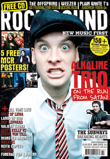
The font in the Rock Sound masthead is a simple, bold, sans-serif font. However, the writing underneith it that says "New Music First" is in a serif font. The mixture of serif and sans-serif makes it look more interesting to the reader. They usually change the colour of the masthead in each issue of Rock Sound.

Metal Hammer
I think the Metal Hammer masthead is really interesting and clever. I like how the word 'metal' has been written in the word 'hammer', it helps give the magazine a brand identity as it is easily recognisable.

I had a look at all the different typefaces on http://www.dafont.com/ to see which sort of ones i could use for my music magazine; here's a few that i found:


THIS POST IS STILL UNDER CONSTRUCTION

Wednesday, November 3

Brand Identity of Rock Sound and NME

Rock Sound
Rock Sound is a music magazine for people who enjoy listening to rock and/or metal music. They tend to change the colours on the front cover in each issue but the colours they use the most are red, which, black and yellow; these are the house colours of the magazine. These colours give the magazine a brand identity, and help people to recognise the magazine when they see it on the shelf in the shop. The masthead of the magazine (pictured above) is a banner masthead. It's in a bold, sans-serif font which makes it stand out to the reader. They don't usually use any of the house colours in the masthead; they change the colours in each issue depending on the colour scheme on the page. Part of the masthead is usually covered by a bit of the main image (you can see an example of this in the picture below). This is because the magazine is so well known that they don't need to show all the masthead for people to recognise it.

This magazine is targeted at a younger audience because most of the colours they use are bright. However, they do use a lot of the colour black (usually in the background), which is usually associated with this genre of music as it is a heavier colour. The language that is used is informal, if they were targeting this at older people they would use more formal language. They tend to have younger and newer bands which teenagers mostly like in the magazine, such as Young Guns, Paramore, and Bring Me The Horizon. However, they do have a couple of bands that are older, so older people can still feel free to read the magazine, such as Killing Joke, Cradle of Filth, and Soundgarden.

Looking at Rock Sound i can tell that it isn't a very serious magazine. There are some serious parts to it, but the target market doesn't particularly want to read a completely serious magazine as they would find it boring. Teenagers prefer something that will entertain them and make them laugh, but still give them the latest news about their favourite bands. This also fits in with their brand identity, as they have a reputation for being quite fun.

Throughout the magazine there are various advertisements for gigs/events that will appeal to the target market. Also, they have a specific gigs/events page near the back so the readers can find out about upcoming events. This gives them a brand identity as people will know them for the place to find out about what gigs are going on.


Most of the typography on the front cover are bold and simple, but some of it is a fun font that shows it's not all serious; this also helps it appeal to the target market more.

NME
NME is a music magazine for people who like listening to indie/rock music. The house colours of NME is red, white and black. They use their house colours a lot more compared to Rock Sound. If you look at the front cover that is pictured below, you can see that most of the page is red, black and white; the only other colour that is on the page is a tiny bit of yellow. The colours in the NME masthead is the house colours, it's also simple and easily recognisable. When someone is looking out for NME in the shop shelves, they will always look for the red, black and white one, this shows that the house colours give the magazine a brand identity that everyone recognises. On the front cover there's usually a large image of a band member/band members to draw people's attention in. The subjects in the images are usually using direct address, which makes it more personal and eye-catching.


I would say this magazine has a slightly wider target market than Rock Sound; the target market is probably teenagers and young adults (up to about the age of 25). I can tell this because they use bright colours and informal language, but they've still made it look sophisticated and use a simple layout.


THIS POST IS STILL UNDER CONSTRUCTION

Monday, November 1

Research: Music Magazine Questionnaire

I created a questionnaire for my music magazine, and gave it to 15 people to fill in so i could get an idea of what my target audience wants.
Here is my results from my questionnaire:

Question 1 - How old are you?
Everyone who did the questionnaire was under 20; this is because my target audience is 14 - 20 year olds.

Question 2 - Are you male or female?
7 of the people who answered the questionnaire were boys, and 8 of them were girls.

Question 3 - What are your three favourite colours?
Blue - 10
Red - 8
Black - 12
Yellow - 4
Pink - 5
Green - 6


Question 4 - Do you download music? If yes, where do you download it from?
10 out of 15 people said yes to downloading music. Most of them downloaded it from iTunes, but some of them also named some such as torrent sites, youtube converters etc...

Question 5 - How often do you buy CDs?
Once a week - 0
Every month - 1
Every few months - 8
Once a year - 1
Never - 5


Question 6 - How often do you buy music magazines?
Once a week - 7
Once every two weeks - 0
Once a month - 5
A few times a year - 3
Once a year - 0


Question 7 - Which music magazines do you buy?
Kerrang! - 9
Rock Sound - 6
Mojo - 2
Metal Hammer - 5
NME - 7

Question 8 - What are your top 5 favourite bands?
A big range of bands came up in the results, such as:
Rammstein, Black Sabbath, Killing Joke, X-ray Spex, You Me At Six, Enter Shikari, We Are The Ocean, Kings Of Leon, Arctic Monkeys, Emarosa, Bring Me The Horizon, City & Colour, Alexisonfire, Skindred, Metallica, Iron Maiden, Bullet For My Valentine, Megadeth, Machine Head, Incubus, Paramore, Deftones, A Day To Remember, Avenged Sevenfold, Alice Cooper, Boys Like Girls, Rise Against, Red Hot Chilli Peppers, Pendulum and The Prodigy.


Question 9 - What genres of music do you prefer?
Rock - 11
Pop - 5
Metal - 12
Drum & Bass - 6
R&B - 4
Classical - 0


Question 10 - How much would you expect to pay for a music magazine?
Everyone said they would expect a music magazine to cost between £1.90 and £3.10.

Question 11 - How often do you go to music
events?
Every week - 0
Every month - 3
Every other month - 0
Every few months - 4
Once a year - 3
Once every couple of years - 0
Never - 5

Question 12 - Do you play any instruments? If yes, please state which one(s).
Guitar - 4
Drums - 2
Bass - 3
Violin - 1
The other 5 people said they didn't play any instruments


Question 13 - What do you use to listen to music?
Computer - 8
iPod - 11
Phone - 9
Radio - 5
Stereo - 4


Question 14 - What content would you expect to see in a music magazine?
Gig Reviews - 15
Interviews - 13
Instrument Reviews - 5
Posters - 13
Latest News - 9
Letters Page - 8
Quizzes - 6
Cartoons - 7
Voting for Awards - 6
Adverts - 6
Band Merchandise - 12
Free Items (e.g CDs, stickers, etc...) - 9


These results show me that the colours that appeal to my target audience most are blue, black and red. These will be the house colours for my music magazine as it will appeal to them more. The things that most people would expect to see in a music magazine are Gig Reviews, Interviews, Posters, and Band Merchandise; so these will be the main things that appear in my music magazine. This would make my music magazine appeal to my target audience more, so therefore more people would want to read it. The main genres of music that people who answered the survey like are rock and metal; bands that fit into these genres will appear in my magazine. These results show that most people buy magazines weekly, so each issue will come out every week.

Friday, October 22

Preliminary Task: Final Contents Page

This is my final version of my school magazine contents page for my Preliminary Task.

On this page i have carried on the house colours, like on the front cover; blue, black and white. However, on this page the theme has more white and blue than on the front cover. Looking at the whole page now, i do wish i'd added more onto the background as it looks a bit too plain. I do like the half border effect that i did though, it gives it a more sophisticated look, just like i was trying to achieve.

I took various photos around my school to add to the contents page. I think these photos help make the page looka bit more lively. Without them it would have been a bit boring.

Preliminary Task: Final Front Cover

                                                   
This is the final version of my school magazine front cover for my Preliminary Task.


My magazine is aimed at sixth form girls who go to a Girls' School. I tried to give my magazine a more sophisticated look, and not the like the typical girly magazines with lots of gossip in it. The colours on the front cover are the house colours; blue and black, with a bit of white, and a big medium close-up image of a student reading a book in a library. I made sure the image took up most of the page so it would be more eye catching to the reader, and also bigger images appeal more to my target market.I decided to not make the student use direct address as it's less personal and more relaxed. The subject in the picture is reading a book in a library, i decided that a library would be a good place for the setting of the image because a lot of students, especially sixth form students, spend lot's of time there.

All of the typography on the page is a white, sans-serif bold font. This really stands out against the background colours as they're quite dark compared to it. I decided to keep it simple and not use too many different fonts as it can get too complicated with loads of different fonts, and can sometimes make the page look too busy and cluttered. The masthead is a very simple font, with the school logo next to it. It is a banner masthead, which goes all the way across the top of the page. I think if I was able to make this again, I would definitely do more to the masthead to make it more recognisable and to make it stand out more, which would give it more of a brand identity. I would also do more with the rest of the writing as it does look a bit too plain for a magazine cover like this. Also, i could have added some cover lines, strap lines and lures on the page, so people would know more of what was inside the magazine, and would want to read on.

The headline on the front cover is "What's happening this term?". I think i should have made this sound a bit more interesting and appealing to the target market. Also, there's barely any writing on it so i probably should have included more information on the front cover.
I think i could have added more effects to my front cover as it looks plain and a bit rushed. Also i should have made the layout a bit busier because at the moment it doesn't look like how i wanted it to. I think if the layout was busier it would grab the reader's attention and look more interesting to them. I decided to keep the background plain , but looking at it now, i could have probably done more to it.


Preliminary Task: Magazine Front Cover Draft

Preliminary Task Research: School Magazine Front Cover 2

I decided to look at another school magazine front cover so i can get a better idea of the type of things they put on a school magazine front cover.

Preliminary Task Research: School Magazine Front Cover 1

For my Preliminary Task, i am making the front cover and contents page of a school magazine. I have looked at a school magazine front cover to get an idea of the type of things that usually appears on there.

Thursday, October 21

Alternative Press Music Magazine Powerpoint

For my next piece of research i looked at the Alternative Press music magazine; I looked at the history, the target audience, what it has to offer the readers, and the plans for the future.

Analysis of Music Magazine Cover: Forms and Conventions

As part of my research for my music magazine i looked at a Kerrang! magazine front cover.

Introduction

This blog has been created so i can present all of my AS level work. I will be making the front cover and contents page for a school magazine for my preliminary task, and a front cover, contents page and features page of a music magazine for my main task. I will be posting my work regularly on this blog to show my research, planning and final work.