Friday, January 14

Evaluation - Question 7: Looking back at your preliminary task, what do you feel you have learnt in the progression from it to the full product?

By looking at the differences between my preliminary task and main task you can really tell how I've progressed since the beginning. They're both different types of magazine, so obviously they're going to look very different because they have completely different audiences. But you can see how my understanding of forms and conventions has progressed.
  • On the preliminary task there is only one image on the whole page, which makes it look a bit plain and uninteresting. But on the main task there is one main image and lots of smaller images around the edge, this makes the page a lot more interesting and gives it a cluttered look, which is what I was aiming for. Also, the images round the edge are at a slight angle; this also helps the page more interesting to look at, and gives a 'scrapbook style' image (like they've just been placed there randomly).
  • In the main task I have used a range of fonts and used different colours, whereas in the preliminary task I've just used the same font throughout the whole page and kept it the same colour. I learnt that using different fonts and colours on the page can make it stand out more to the reader and be more interesting to look at.
  • On the main task i have used Buzzwords to attract the reader's attention more. Using words like 'EXCLUSIVE!' makes the reader feel as if this is the only place to read that piece on information, so it would make them want to buy the magazine more. I put the word 'EXCLUSIVE!' in a different font, and did a red outer glow effect on it so it would stand out more on the page.
  • Since the preliminary task my photography skills have progressed; I've learnt a lot about camera angles, lighting and editing photos.
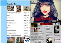
For my features page you can definitely see how i have progressed since the preliminary task. For example; the layout of the main task is a lot busier, and fits the conventions of a magazine more. I have used a range of different fonts on my main task contents page, which makes the page look busier, and more interesting to the reader. For the preliminary task, all the images are very organised, and are all the same size, but on the main task, all the images aren't in any order and they're all different sizes. While doing my research on music magazine contents pages, i found that in Kerrang! they now usually have one main image at the top of the page advertising the main features page that's going to be in the magazine. So i decided to include an image from my features page at the top of the page so it fits in with the forms and conventions.

Wednesday, January 12

Evaluation - Question 5: How did you attract/address your audience?

My magazine is very different to most music magazines that are around; the only other music magazines that have some similarities are Kerrang! and Rock Sound. I think that my magazine is different to Kerrang! and Rock Sound because it has a wider market, and it's aimed at both boys and girls. 
Noise Pollution offers readers the chance to read the latest news about their favourite bands, plan which gigs to go to, read album and gig reviews, and win really cool stuff! This is exactly what my target market wants to read about, so this is why they'd want to buy it!

 If you have a look at my reader profile you can see that:
  • My ideal reader loves going to gigs - this is why the gig guide would appeal to them. It tells them all of the gigs that are going on in the next few months so they can plan which ones they're going to. This is also why the gig reviews will appeal to them; they can read about their favourite band's live performances, or even read about gigs they've been to!
  •  My ideal reader loves attending festivals - this is why the competition section would appeal to them; they get the chance to go to their favourite festival with a VIP ticket for free! This would be useful to them because the price of festival tickets is very expencive (around £180/£190 for a weekend ticket!), and my ideal reader doesn't earn an awful lot of money, so for them to get the chance to go for free would be great!
  • Music has a huge part in my ideal reader's life, they play instruments, they go to gigs and festivals, and they download and listen to music on a regular basis. As music is such a big part of my ideal reader's life, they would obviously want to access a magazine about it easily, and for quite an affordable price.
  • My ideal reader doesn't earn a lot of money and a lot of them don't have full time jobs, so Noise Pollution is perfect for them as it is at a reasonable price.

Tuesday, January 11

Evaluation - Question 4: Who would be the audience for your media product?

Evalution - Question 3: What kind of media institution might distribute your media product and why?

I did some research into media institutions, and which ones distributed which music magazines. I found that each media institution tends to publish a certain genre, and targets a certain market.


I first looked at ipc media because we'd already had a look at them when we were doing the reader profiles in class. I found that they don't really publish a good range of music magazines though, the only music magazines i could see on the were the ones that we'd already looked at; NME and Uncut.


After doing some more research I found a perfect media institution to publish my music magazine - they're called Bauer Media Group.
I think that Bauer Media group would be the perfect media institution to distribute my music magazine because:
  • They are a very well known institution. They operate in around 15 countries, so they'd be able to distribute my magazine abroad, so it would eventually be recognised in lots of different countries.
  • They also own Kerrang! magazine, and Kerrang! TV. Kerrang! is one of the main magazines that i researched, so my music magazine is very similar. If they've already published a similar magazine to mine, they must know lots about the target market, and the right places to distribute the magazine.
  • Becuase Bauer Media Group has a 50% stake in the British Television Company, they have a lot of control of what is shown, so they may be able to do a lot of television advertisement for my magazine. This will mean that it'll get a lot more publicity.

Evaluation - Question 2: How does your media product represent particular social groups?

The social group i was aiming at was male and female teenagers between the age of 15 and 25. To do this I included certain things in my magazine (images, fonts, and colours) to represent them correctly.
The images that I used in my magazine are similar to those that are used in real music magazines in the media. For example; pictured below is an image from Kerrang! compared to one of the images i used in my music magazine.
Similarities
In the images pictured above you can see that they're both close ups of females between the ages of 15 and 25 (the age of my target market). 
Both the subjects are using direct address, which makes it a very powerful image and grabs the reader's attention. Using direct address makes it a lot more personal, and makes the reader interested in what the magazine is about.
They're both standing in front of a white background, which brings all the attention on the subject. Personally, I thought this worked best on my image because it brings out the colour of the subject's eyes and lips more. My image represents the fun personalities the social group has, whereas the Kerrang! image represents their more serious side.
Both of the images are confident and powerful, which shows the social group's personalities; they usually tend to be very confident and like partying a lot. This is also represented because it's a strong, striking image.
The lighting in both of the images are quite similar; they're both quite light images. I think this shows how innocent teenagers can be, and how vulnerable they can be (you can see everything in the image, nothing is hidden).

Differences
In the image that i took, the subject's make up is a lot more colourful (she's wearing red lipstick and has bright blue eyes), whereas in the picture from Kerrang! the colours are a lot less vibrant.
The image from my magazine is very playful and fun, whereas the image from Kerrang! is quite a serious image.